The new Intranet Now logo
Did I ever explain what our old / current logo was all about?
As you might know, Brian and I launched Intranet Now very quickly back in 2014, and had a cracking first conference.
I had this idea of a bullseye target – suggesting ‘now’ as per our conference name. I cut out a bit at the bottom to add abstract interest.
It didn’t blow Brian away. Still, for three minutes work I didn’t expect it to. I offered to make it square, as square was so hot right then.
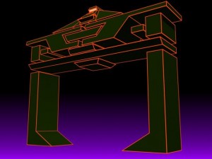 Brian said ‘OK’ and that was that. So, the old logo was supposed to be a target (like in archery) but became something like the Reccognizer’s from Tron.
Some people wondered if the logo was an open door to intranet land, and I think that’s fine!
However, we do need a new logo and we now have several options for you to peruse. What do you think? Please let us know.
Image copyright of Disney, used for necessary illustration purposes in (hoped for) accordance with USA fair use.